Dashboard
In this section you will find information regarding creating, customizing, and sharing interactive visualizations of your data.
Dashboards provide a centralized view of your data through a collection of visualizations, saved searches, and controls. They allow you to monitor trends, compare data across different time periods, and quickly identify anomalies or patterns in your logs.
Common use cases:
- Real-time monitoring: Track key metrics and system health at a glance.
- Trend analysis: Visualize data patterns over time to identify issues or opportunities.
- Reporting: Create comprehensive views for stakeholders or team members.
- Correlation: Combine multiple visualizations to understand relationships between different data sources.

Dashboard components
The dashboard interface contains the following main components:
- Toolbar - Access dashboard actions such as full screen, clone, edit mode, and reporting.
- Search - Query data using DQL or Lucene syntax to filter all visualizations.
- Filter - Add field-based filters to narrow down displayed data.
- Time picker - Set the time range for all dashboard visualizations.
Each component is described in detail in the following sections.
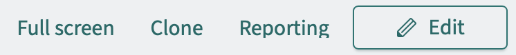
Dashboard toolbar
Access following options from the dashboard toolbar:
- Full screen: View the dashboard in full-screen mode for presentations or monitoring displays.
- Clone: Create a copy of the entire dashboard.
- Reporting: Generate and manage dashboard reports.
- Generate report: Download the current dashboard view as PDF or PNG.
- Schedule and share: Create a report definition for automated report generation.
- View reports: Access previously generated reports.

Dashboard toolbar
- Edit: Switch to edit mode to modify panel layout and settings. In edit mode, additional toolbar options appear:
- Options: Configure dashboard display settings:
- Use margins between panels: Toggle spacing between panels.
- Show panel titles: Toggle visibility of panel titles.
- Add: Add existing visualizations to the dashboard.
- Cancel: Discard changes and exit edit mode.
- Save: Save changes to the dashboard.
- Options: Configure dashboard display settings:
Dashboard create new
- + Create new: Create a new visualization directly on the dashboard. Available visualization types include:
- Area: Display data as a filled area chart.
- Controls: Add interactive input controls to filter dashboard data.
- Coordinate Map: Plot geographic data on a map using coordinates.
- Data Table: Display data in a tabular format.
- Gantt Chart: Visualize timelines and schedules.
- Gauge: Show a single value within a range.
- Goal: Track progress toward a target value.
- Heat Map: Display data density using color gradients.
- Horizontal Bar: Create horizontal bar charts.
- Line: Display data as a line chart over time.
- Maps: Visualize geographic data on interactive maps.
- Markdown: Add formatted text, links, and images using Markdown.
- Metric: Display a single prominent number.
- Pie: Show proportions as pie or donut charts.
- Region Map: Color geographic regions based on data values.
- TSVB (Time Series Visual Builder): Create advanced time series visualizations.
- Tag Cloud: Display word frequency as sized text.
- Timeline: Create time-based visualizations with expressions.
- Vega: Build custom visualizations using Vega grammar.
- Vertical Bar: Create vertical bar charts.
- VisBuilder: Drag-and-drop visualization builder.
For more information on visualization types, see the OpenSearch Visualize documentation.
For step-by-step instructions on creating a new dashboard, see Create New.
Use the search bar at the top of the dashboard to filter data across all visualizations. The search supports multiple query languages:
- DQL (OpenSearch Dashboards Query Language): A simplified query syntax for filtering data. Toggle DQL mode using the DQL button on the right side of the search bar.
- Example:
host.name: "webserver01" and status: "error" - Example:
response_time > 500
- Example:
- Lucene syntax: For more advanced queries when DQL is disabled.
- Example:
host.name:"webserver01" AND status:"error"
- Example:
Queries entered in the search bar apply to all panels on the dashboard simultaneously.
For more information on DQL syntax, see the OpenSearch Dashboards Query Language documentation.
Applying filters to dashboard
Apply filters to narrow down the data displayed across all panels:
- Click Add filter below the search bar.
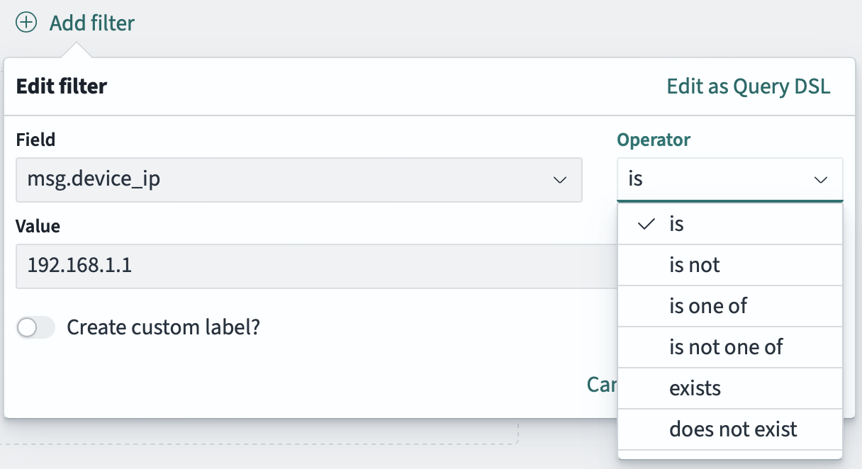
- In the Edit filter dialog, configure the following:
- Field: Select the field to filter on (e.g.,
msg.device_ip). - Operator: Choose the comparison operator:
is- exact matchis not- exclude exact matchis one of- match any of multiple valuesis not one of- exclude multiple valuesexists- field exists in the documentdoes not exist- field does not exist in the document
- Value: Enter the value to filter by (e.g.,
192.168.1.1).
- Field: Select the field to filter on (e.g.,
- Optionally, enable Create custom label to give the filter a descriptive name.
- Click Save to apply the filter to all visualizations on the dashboard.
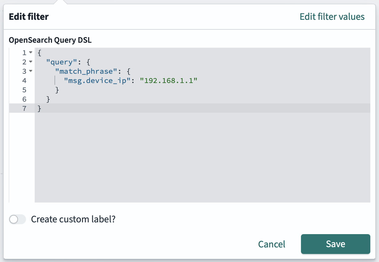
For advanced filtering, click Edit as Query DSL to write filters using OpenSearch Query DSL syntax.
For more information on Query DSL syntax, see the OpenSearch Query Domain-Specific Language documentation.
Applying Query DSL filters to dashboard
Edit dashboard filters
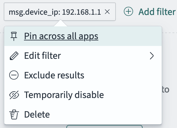
Once a filter is applied, it appears as a pill below the search bar (e.g., msg.device_ip: 192.168.1.1). Click on the filter pill to access the following options:
- Pin across all apps: Keep the filter active when navigating to other applications (Discover, Visualize, etc.).
- Edit filter: Modify the filter field, operator, or value.
- Exclude results: Invert the filter to exclude matching results instead of including them.
- Temporarily disable: Disable the filter without deleting it, useful for testing.
- Delete: Remove the filter completely.

Edit all dashboard filters
Click the filter icon (funnel) on the left side of the filter bar to access bulk actions for all filters:
- Enable all: Enable all currently disabled filters.
- Disable all: Disable all filters without removing them.
- Pin all: Pin all filters across all apps.
- Unpin all: Unpin all filters so they only apply to the current app.
- Invert inclusion: Toggle all filters between include and exclude mode.
- Invert enabled/disabled: Toggle the enabled state of all filters.
- Remove all: Delete all filters at once.
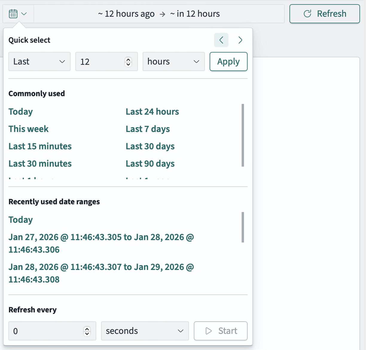
Use the time picker in the top-right corner to set the time range for all visualizations on the dashboard. Click on the time display to open the time picker panel.
Time picker options
Create a custom relative time range by specifying:
- Direction: Select
LastorNext - Value: Enter a number
- Unit: Choose from seconds, minutes, hours, days, weeks, months, or years
Click Apply to set the time range. Use the arrow buttons to quickly shift the time window forward or backward.
Select from predefined time ranges for quick access:
- Today, This week
- Last 15 minutes, Last 30 minutes
- Last 24 hours, Last 7 days, Last 30 days, Last 90 days
Access previously used time ranges for quick reselection. This list automatically populates as you use different time ranges.
Set up automatic dashboard refresh:
- Enter a number and select the time unit (seconds, minutes, hours).
- Click Start to begin auto-refresh.
This is useful for monitoring dashboards that need to display real-time data.
Time picker options
Click on the start or end date in the time display to set specific boundaries. Each boundary offers three modes:
- Absolute: Select a specific date and time from a calendar picker.
- Relative: Set a time relative to now (e.g., “12 Hours ago”). Options include:
- Enter a number and select a unit (seconds, minutes, hours, days, etc.)
- Enable Round to the hour to align the time to the nearest hour
- The calculated date is shown below
- Now: Set the boundary to the current time (updates dynamically).
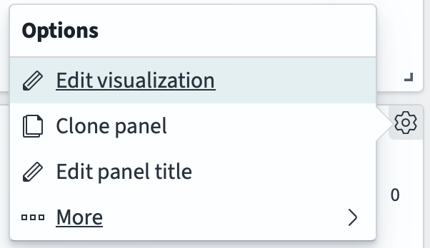
Each panel on a dashboard can be customized. First, click Edit in the dashboard toolbar to enter edit mode. Then click the gear icon in the top-right corner of any panel to access the Options menu:
- Edit visualization: Modify the visualization settings, data source, and display options.
- Clone panel: Duplicate the panel to create variations without affecting the original.
- Edit panel title: Change the panel’s display title.
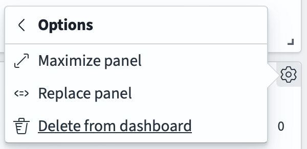
- More:
- Maximize panel: Expand the panel to full screen for detailed viewing.
- Replace panel: Replace the current visualization with a different one.
- Delete from dashboard: Remove the panel from the dashboard.
You can also resize panels by dragging the bottom-right corner, and move panels by clicking and dragging the panel header.
Panel customization options More panel customization options